A misunderstanding about life expectancy
08 Dec 2016Here I want to talk about a very common mistake when it comes to life expectancy and its interpretation. In one of my epidemiology courses, the lecturer showed the below Figure.
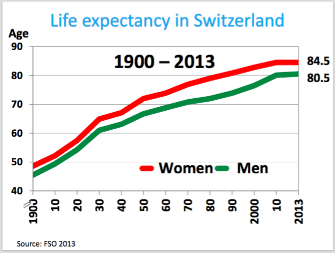
I am sure you also see graphs like that not this particular one (I mean for Switzerland) but maybe similar. OK, we see a very clear trend that life expectancy increasing in the last century. It was even doubled, right? That’s very nice. And we also see that there is clear difference between men and women but it is not my issue here.
I am more interested in the increase of the life expectancy. To understand it better first important question is, as always, why. In other words what is the possible explanation. And second question, what can we guess about the life expectancy of 2100 for example, so the prediction. My lecturer gave the answer for the first question: the remarkable achievement of modern medicine. And so by this logic, he said that the life expectancy probably may continue to increase as we had in the last century.
Now, let’s consider not 1900 but long before, for instance think about our ancestors, hunter gatherers. What we expect is that they may have similar (or even low say 30?) life expectancy like 1900, right? So lets think from a hunter gatherer perspective and see this below Figure for this purpose.

Our ancestors did not get it why they could not survive after 30. But the achievements of the medicine fully can explain it?
At this point, to understand better, we need to look at the precise definition of the life expectancy (from Wikipedia):
The mean length of life of a hypothetical cohort (all individuals born in a given year) assumed to be exposed since birth until death of all their member to the mortality rate observed at a given year.
OK, the definition seems unnecessarily complicated, but important point is that life expectancy is just a mean. So it is one type of statistical measure. But to gain more insight about the data maybe it is better to look more than just mean values. Unfortunately, I don’t have the real data, so lets just simulate some data for our purpose and plot it:
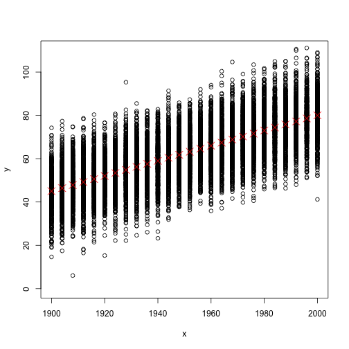
Now in the above Figure, you see all data points (the mean length of life bla bla bla per person) as well as the life expectancy as red crosses (or let’s call it mean values). But the problem is that in reality data do not look like that Figure, but instead more look like the below Figure.
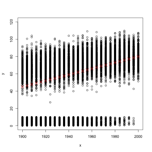
So lets compare those two Figures which are based on two different simulated datasets. Firstly the red crosses are exactly has the same values (monotonically increasing from a value close to 40 to a value close to 80). That implies mean values are the same. But in the second Figure, there are many data points very close to zero values. But the second set of data points of each given year (values which are far away to zero) seem to not increasing much. So what does that mean?. Those very small data points corresponding to children who died at very early ages (infant mortality). And as you can see, with decreasing of the infant mortality, the mean values are going away from zero even if the adult mortality stays constant.
That means, back then, your expected value of length of life is very low when you are child. But once you reach the adulthood then it is not that low like 30. That’s why even in the times when the life expectancy is 30, you can see many people of high ages like 60.
OK, I exaggerated a little bit to make the point, and of course the advancement of modern medicine (better medications etc.) is a very important explanation of the increase of life expectancy. But still I think considering only the mean values can be misleading since infant mortality has possibly more effect on the increase of life expectancy.